
Your podcast cover art (aka podcast logo) is responsible for people’s first impression of your show. In a split second of seeing it, they’re going to decide whether to click or keep scrolling. So making it enticing is pretty important.
Ideally, you want it to communicate what your podcast is about quickly and have it stand out from all the others on directories like Apple Podcasts. And you’ve only got a small square to do it in. Easier said than done.
But don’t worry, there are some simple guidelines to follow. We’ll go through the do’s and don’ts when it comes to podcast cover art, and then we’ll outline how you can actually make one for yourself with easy-to-use, free software (no photoshop skills needed!).
The Do’s & Dont’s of Podcast Cover Art
There are some universal rules that most good podcast logos follow. Here are the features you’ll want to include (and those you should avoid) when designing yours.
Do: Show What You’re About
The point of your podcast logo is to attract people who want to hear what you have to say. So you want to give a decent idea of the podcast at a glance. It’s got to convey two things: what the podcast is about, and what kind of podcast it is / what tone it has. Is it a comedy, a mystery, a serious advice podcast? Whatever the answer is, the cover art should reflect that.
You want to show what’s unique about your podcast. Figure out what makes your podcast perfect for your target audience, and try to represent that visually.
Take How To Money as an example. It gives financial advice to regular people - that you don’t need an economics degree to understand. So it has banknotes in the background, as symbols for money. It also shows they’re making finance approachable, with a friendly image and a cartoonish style.
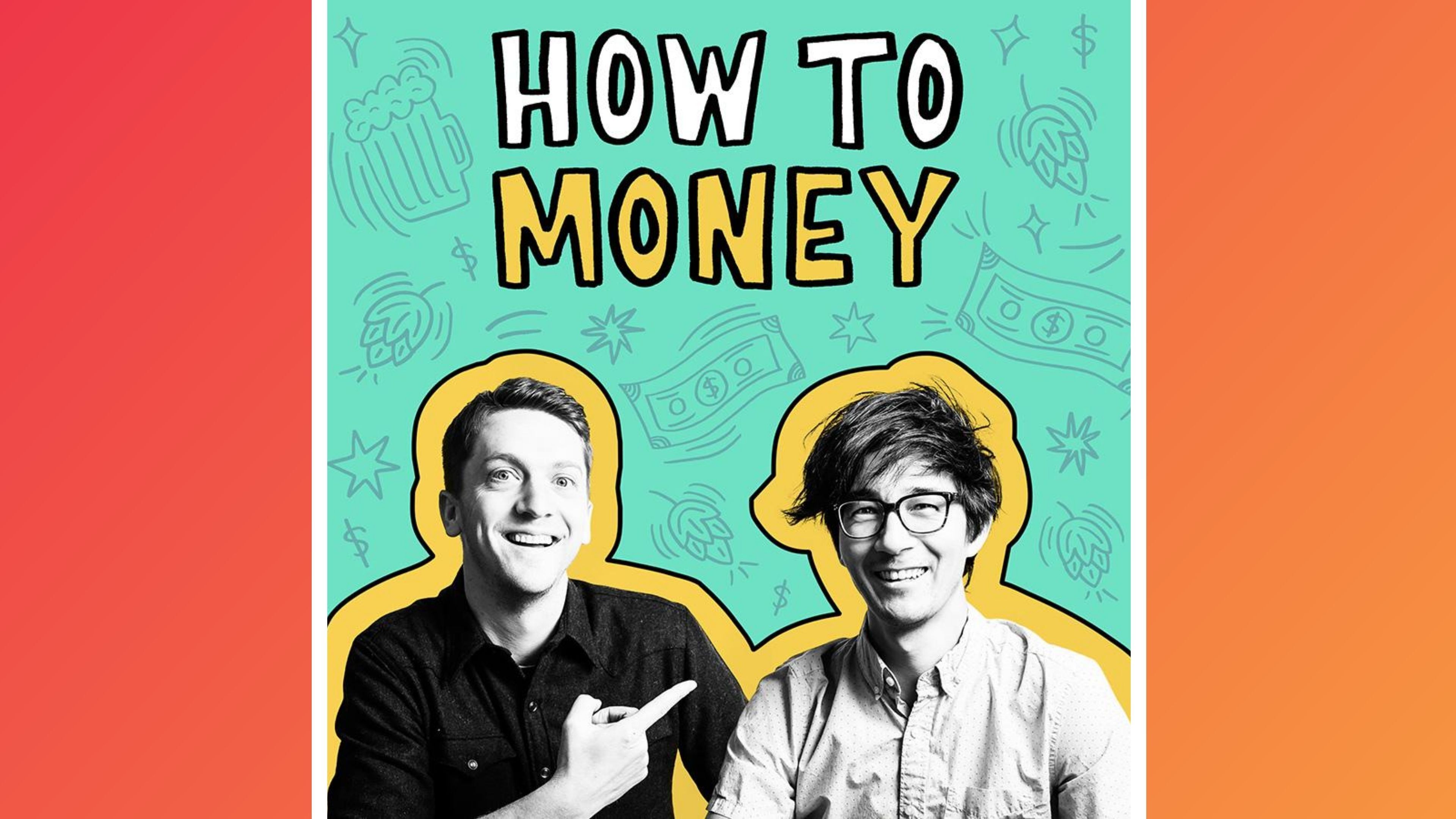
There’s no need to invent an entirely new image or concept. It’s not the most original idea in the world to use banknotes in a podcast about finance. But the important thing is how you combine the different symbols and design themes into one unique design.
Do: Meet Podcast Directory Image Specs
Ideal image size = 3000 x 3000 pixels
The good news is, pretty much every podcast directory has the same specs. Follow the requirements for Apple Podcasts and you should be good to go. That means your podcast logo has to be square, and it needs to be between 1400 x 1400 and 3000 x 3000 pixels in size. The closer you are to 3000 x 3000, the better. You’re less likely to have to update your image for the future if the specs change again, and your image will be better quality.
Your art also has to have 72 dpi resolution, and it must be in the RGB colourspace. However you shouldn’t have to worry about these much. Just make sure any images or icons you plan on using don’t look grainy or low res and you’ll be fine.
If you'd like to see a preview of how your artwork will display on platforms like Apple Podcasts and Spotify, you can use this free preview tool from OnlyPod. If it isn't displaying quite how you'd like it to, then it's time to go back and make some adjustments.
Do: Make Your Podcast Logo Adaptable
Your cover art is going to be the face of your show. So it needs to work everywhere you want to promote your podcast. Your logo should be adaptable for website banners, business cards, social media avatars, and any merch you might make like bags or hoodies.
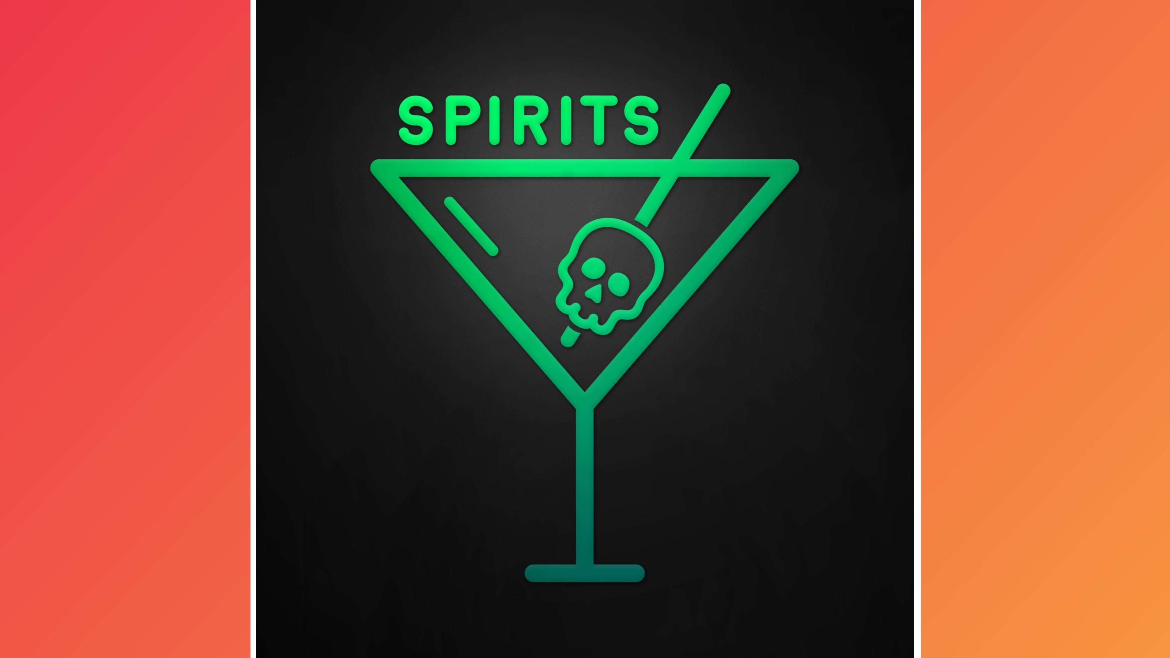
You don’t have to use the exact same artwork for all these. But using consistent images, fonts and colours will help make your brand recognisable. For a great example of how you can do this, take a look at Spirits. Their cover art looks like this:
But they also have a custom banner on their website which looks like this:
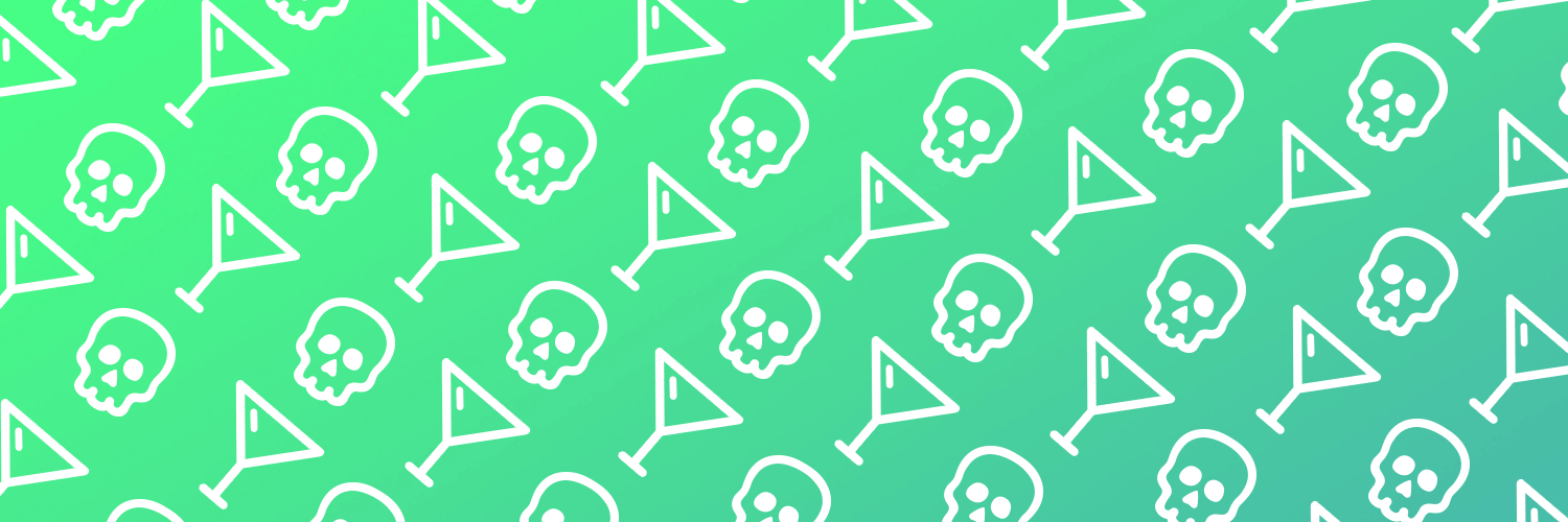
The artwork and banner are different. But they’re coherent together, and it’s immediately obvious that they’re all part of the same brand. Likewise, you should ensure your podcast artwork is flexible enough to work well across multiple sizes, formats, and locations.
Do: Test Your Ideas & Gather Feedback
Before you get too attached to one podcast logo, it’s a good idea to check out how effective it is. Have a scroll through other podcasts in your genre to see the competition, and make sure your idea isn’t too similar to anything else already out there.
See if friends can guess what your podcast is about from just your artwork.
Getting feedback on your podcast logo is another vital step. See if your friends can guess what your podcast is about from just your cover art. Put it next to other podcast logos and ask if they’d stop at yours. It can be difficult to have an objective view on something you’ve poured hours of work into. So getting other opinions on whether your podcast logo does its job can provide some clarity.
Don’t: Make Your Podcast Logo Too Busy
Less is more when it comes to podcast cover art. Someone’s scrolling through a sea of small icons deciding which one to take a chance on. They’re going to click on the one that captures their attention immediately. Having a busy design with lots of different elements requires the viewer to work to figure out what’s going on. That’s not good.
A simple logo is also more memorable. As any marketing expert will tell you, the more memorable your branding is, the better. So don’t add unnecessary pictures, and try not to pack your logo with words. The podcast title should be enough text. Don’t be afraid to cut down on design elements if you need to.
It’s also worth keeping in mind that you shouldn’t put too much at the edges of the square you’re working in. Apple recommends not putting any text in the bottom 15% of the cover art, as this part is often covered up by a player icon. So try to use the middle area of your cover art as the focal point.
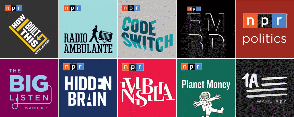
NPR have long been industry-leaders in creating clean, simple, and memorable podcast artwork. Check out some of their classic minimalist designs below for inspiration:
Don’t: Use Intricate Fonts
It’s easy to get carried away trying to make your podcast title look fancy and exciting. But the number one priority with any words in your logo is that they’re legible. This has got to be true even when the logo is shrunk down to a small icon for a phone screen. As beautiful an intricate script might look, it’s no good if it’s difficult to read. Try shrinking down your logo to 55 x 55 pixels and see if it’s still easy to read before you commit to a certain font.
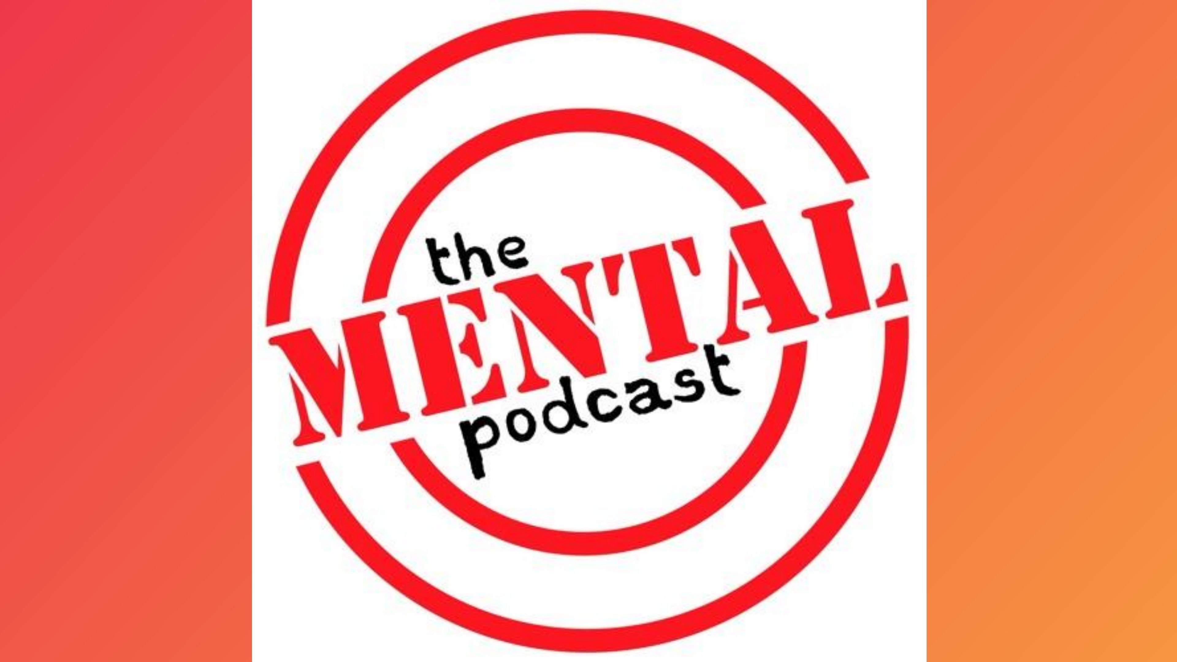
A good rule of thumb is to stay within one or two fonts. Any more than this and your logo will be visually confusing. Most of the time one well chosen font is more than enough, but if you’re going to use two, make sure there’s a reason for it. This could be to emphasise a certain word, like on The Mental Podcast. The two different styles of lettering you use should be distinct. Making one serif and one sans serif is a failsafe tip if you’re stuck on what fonts work well together.
Don’t: Include Overused Images or Fonts
Your goal is to stand out from the crowd. Pictures of headphones or microphones to show that it’s a podcast might have been a great idea to begin with. But by now Apple Podcasts is chock-a-block with those types of images, so you’re going to want to be a little different to stand out. Besides, if someone’s scrolling through their phone looking for a new podcast, chances are they already know your show is a podcast - so you don’t need to confirm that with a mic icon.
Another thing to avoid is fonts that have become too overused. There’s nothing wrong with going old school with your lettering. But try to stay away from Arial, Times New Roman, and Helvetica. They’re too common, and everyone’s already got other brands and connotations they associate with those particular styles. Going for something a bit different will make your podcast logo more distinctive.
Don’t: Break The Rules
Apple Podcasts says your podcast cover art can’t include references to illegal drugs, profanity, or violence. It’s not worth seeing if you can get away with breaking these rules. You’re going to want the biggest directory in the world on your side on this one.
Another thing to be aware of is that the images and fonts you use need to be uncopyrighted. The easiest way to get all this is to use the free templates on Canva (more on that below).
How To Create Your Podcast Logo
Designing your own cover art can be a pretty daunting task. But it’s easy once you know where to start. Whether you’ve got a bit of budget to work with, or you want to do it for free, you’ll end up with an amazing podcast logo.
Design it Yourself on Canva
With loads of free design technology available online, it’s easier than ever to create your own podcast logo. Canva is the perfect option, whether you’re a talented artist, or you barely know what the words ‘graphic design’ mean.
You don’t need to know anything about sourcing images, fonts or backgrounds - Canva does it all for you. The free templates are uncopyrighted. And the days of wrestling with a computer that refuses to work the way you want it to are over. The tools on Canva are intuitive, even if technology isn’t your strong point.
The best thing about this option is it’s free. The costs of running anything can build up ridiculously quickly, so anywhere you can cut down on spending is a win.
The downside of using Canva is it can be restrictive. If you have a clear vision of what you want your artwork to look like, you may not be able to recreate it exactly how you want on Canva. You may have to settle for something that’s ‘close enough’. However if you don’t have strong opinions on what your logo should look like, Canva templates should allow you to create something that fits the vibe of your show.
Hire a Designer
If you’ve got the money to spare then you might want to consider hiring a designer. Designing your own logo is going to take some time. And if you’d rather focus on actually making your podcast than creating the art for it, delegating the design work to someone else could be a good option.
We’d recommend using a site like Fivver or Upwork, where you can find a freelance designer to fit your needs. You can see people’s portfolios and read reviews, to make sure you’re spending your money wisely.
If you already have an idea of what you want for your podcast logo, we’d recommend making a quick mock up first on Canva to show the designer. A minute or two of your time doing this could save a lot of hassle down the line, if it helps them understand exactly what you want. It might cost more to make more changes later on, so that’s all the more reason to point them in the right direction at the start.
Time to Make Your Podcast Logo!
There you have it, all you could want to know to make your new podcast logo. If you give yourself time to play around with different ideas, and follow the guidelines above, you can’t go wrong. You’re already well on your way to making something your target audience will want to click on. Good luck!
For our full, comprehensive guide on how to start a podcast, click here.


